Spid Mobile App
Reducing Time-to-Value through thoughtful mobile UX and increase customer retention
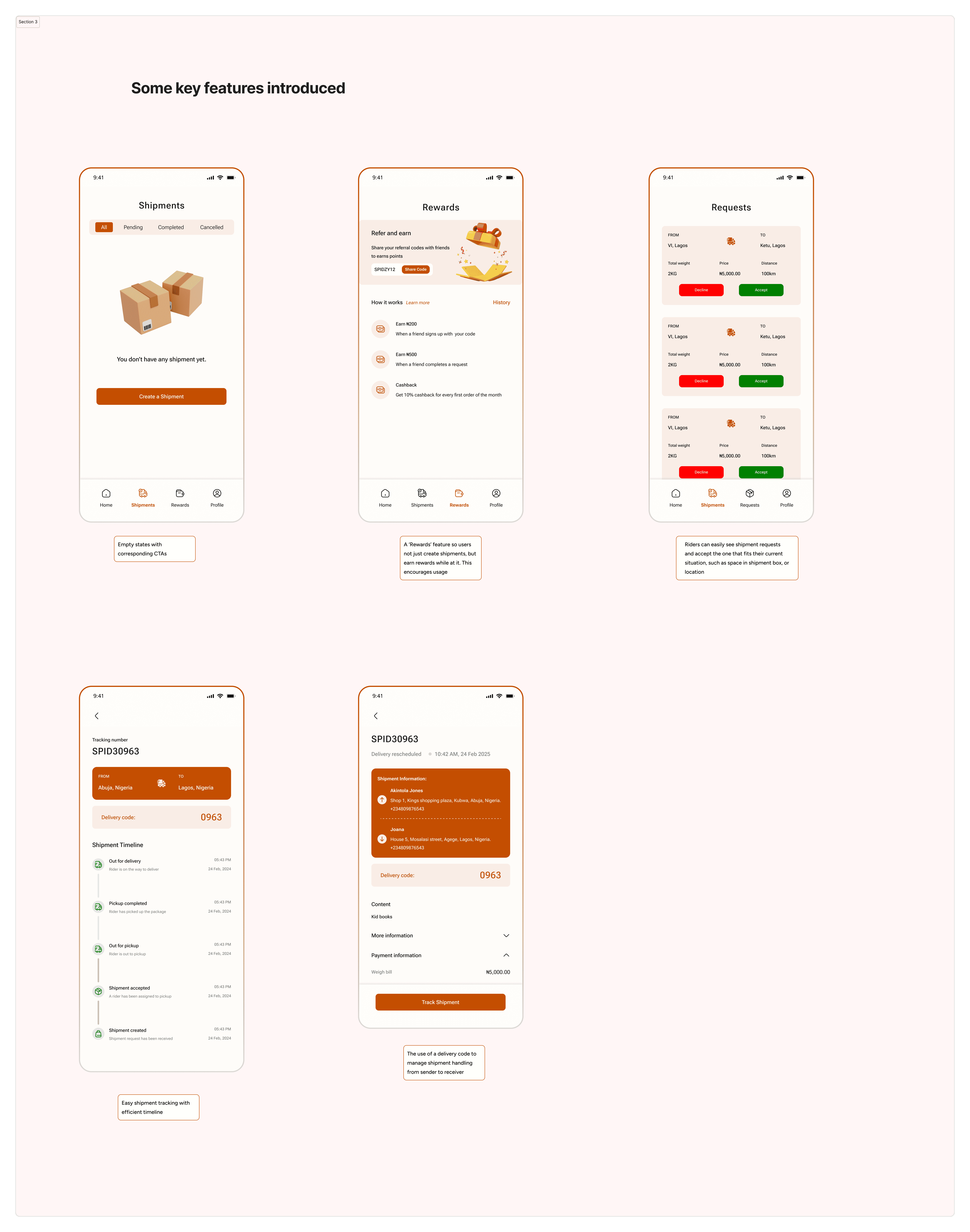
A mobile app experience redesigned to make booking and fulfilling deliveries faster, clearer, and more intuitive for both individuals and businesses. This project focused on modernizing the interface, reducing cognitive load, and creating distinct yet connected user journeys for customers booking deliveries and riders completing them.
Client
Spid Delivery Service
Services
Native app Design iOS & Andriod
Industry
Logistics
Duration
6 weeks

This project explores how improving clarity and reducing cognitive load can significantly impact a delivery booking experience. The app serves two key user groups — customers (individuals and businesses booking deliveries) and riders (handling fulfillment). The existing experience introduced unnecessary friction, slowed time to value, and lacked clear paths for each user type. My goal was to design a more modern, intuitive mobile experience that: - Reduces mental effort during booking and delivery flows - Separates and optimizes experiences for customers and riders - Helps users complete their core tasks quickly and confidently The result is a streamlined, dual-path experience that gets users from intent to action with minimal friction, whether they’re booking a delivery or completing one.
-The Challenge/Problem
The existing delivery app experience made it difficult for users to quickly complete their primary tasks, booking a delivery or fulfilling one. Customers and riders were guided through similar flows, despite having very different goals, which increased cognitive load, slowed task completion, and led to frequent drop-offs.
From a business perspective, this friction directly impacted key metrics: longer booking times, reduced successful order completion, unclear rider workflows affected fulfillment efficiency, and the lack of a modern, intuitive interface weakened user trust and retention, especially for business users who rely on speed and reliability.
Without clear user paths and a streamlined experience, the product risked losing users to faster, more intuitive competitors and limiting its ability to scale as a two-sided delivery platform.
-The Process
This redesign followed a UX-led, problem-first approach. I started by auditing the existing experience to identify friction points affecting both users and business outcomes. Insights from this evaluation informed clearer problem definitions and the creation of distinct user journeys for customers and riders. From there, I iterated through wireframes, refined interactions, and modernized the interface to reduce cognitive load and speed up time to value, ensuring the final solution balanced usability, scalability, and business goals.
-Solution
The redesigned experience was guided by a single goal: to make shipping feel fast, intuitive, and trustworthy for both users and the business.
To achieve this, I modernized the visual language, clarified interactions, and redesigned core flows, onboarding, shipment creation and tracking, and the homepage, to align with users’ mental models of how deliveries are typically booked. Each screen was intentionally designed to reduce cognitive load, surface primary actions early, and guide users smoothly from intent to completion.
From a business perspective, every design decision was made with retention and revenue in mind. By shortening time to value, eliminating unnecessary steps, and creating clearer paths to successful shipment creation, the new experience encourages repeat usage, reduces abandonment, and supports scalable growth.
The result is a cleaner, more intuitive product that not only looks modern but also works harder, helping users complete tasks with confidence while driving meaningful business outcomes.
-Results & Impacts
Onboarding flow
Impact: Faster activation and reduced early drop-offs
Metric:
+30% increase in completed onboardings
-25% reduction in onboarding abandonment
-35% decrease in time to first successful action
By simplifying entry points and clarifying next steps, users reached value sooner, increasing the likelihood of retention.
Shipment Creation Flow
Impact: Higher task completion and revenue conversion
Metric:
+28% increase in successful shipment creation
-25% reduction in shipment creation errors
-30% reduction in average booking time
Aligning the flow with familiar delivery mental models made shipment creation feel intuitive, directly improving conversion and repeat usage.
Homepage Experience
Impact: Improved discoverability and repeat engagement
Metric:
+22% increase in returning users
-20% reduction in bounce rate
+18% increase in feature engagement from homepage CTAs
Clear hierarchy and focused actions helped users quickly understand what to do next, reinforcing confidence in the product.
Business Outcomes
Improved user retention, leading to increased lifetime value
Higher shipment volume directly impacting revenue
Reduced support overhead due to clearer flows and fewer errors
By modernizing the interface and rethinking core user journeys, the redesign transformed key touchpoints into conversion drivers. The product now supports user goals more naturally and, in doing so, delivers stronger, more sustainable business results.